CONGRATULATIONS! YOU FOUND THE EASTER EGG


LetterBoxd
Revamped the Letterboxd Website. The process encompassed the entire design journey, from creating a new Brand Identity logo to developing a high-fidelity prototype. This included crafting mood boards to establish the website's overall aesthetic and making informed decisions on fonts and color themes to build a cohesive brand identity.
Role
Lead Designer
Timeline
Aug - Dec 2022
Skills
Typography
Color Theory
Brand Design
UI Design
Tools
Figma
Coolors.co
Photoshop
PROJECT OVERVIEW
What is Letterboxd?
Letterboxd is a social film discovery and journaling platform. The users can rate, review and follow members on Letterboxd.
Why this website?
I have been using Letterboxd for around 5 years and it has numerous features which the users can only come across after they use it a few times. Since this website has a lot to offer, I feel the features are hidden and are difficult to discover. This website has a huge potential to improve the user experience.
Redesign elements
I chose to redesign 5 crucial pages on this website - landing page, homepage, members page, profile page, and Journal page. These pages are already present on the website however they did not follow User interface principles and lacked a visual aesthetic. It was hard to understand what the website had to offer when the user first opened the website. I chose to add textual and visual cues to assist the user in developing a deeper understanding of what the website is about.
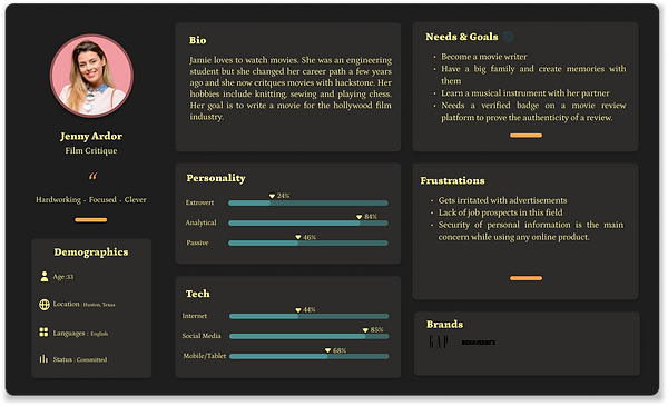
PERSONAS
%201.png)
%201.png)
%201.png)
SWOT ANALYSIS

MOODBOARD
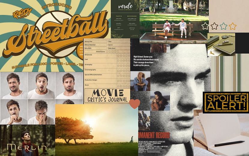
Viewers might have
contrasting opinions on a movie,
depicted by a set of human emotions.
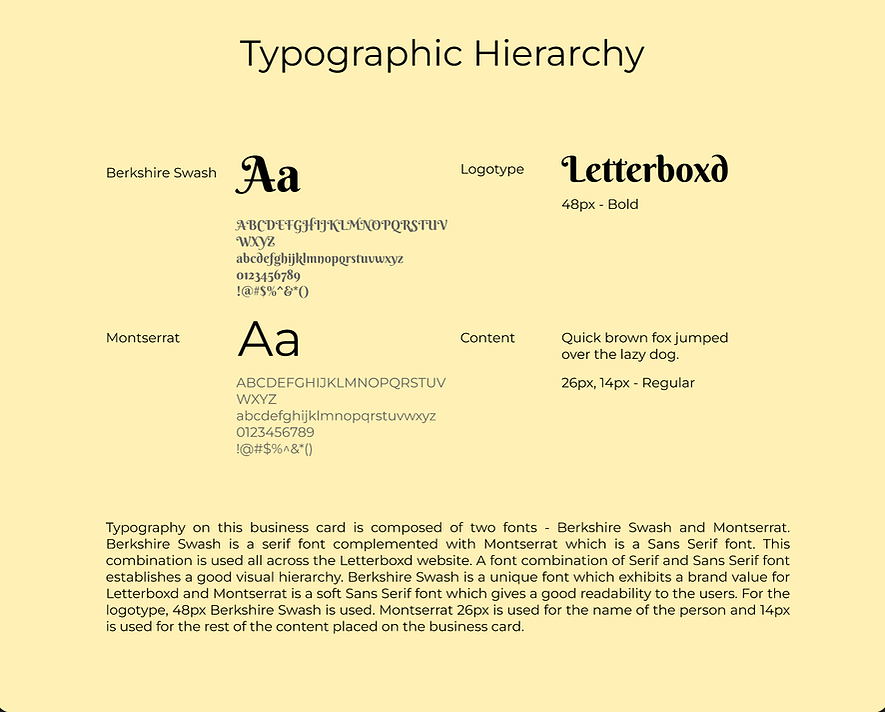
Berkshire Swash & Montserrat font
Classic neutral
color palette
Feature to hide spoilers
whenever someone
posts a review hinting
any kind of spoilers
Movie discovering & journaling platform
.png)
.png)
Logo Design
Descriptor Words
MOVIES
STREAMING
REVIEWS
DIARY
DISCOVER
Filmdom
Drive-in
Comedy
Popcorn
Theater
Ratings
Actor
Cast
Genre
Netflix
Hulu
Disney
Television
internet
wifi
remote
list
rank
mobile phone
good
bad
stars
helpful
critiques
article
notice
evaluationstories
feedback
comment
response
journal
log
record
write
paper
pen
book
bindings
calendar
organize
note
blog
documentarchive
explore
find
hike
adventure
recognizeglimpse
compass
lookout
idea
invent
plan
.png)
Design Principles
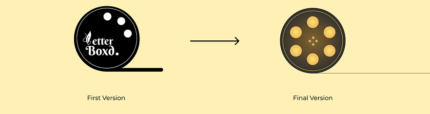
1. Symmetrical Balance
There are a total of 6 reel knobs which are placed such that they follow the symmetrical balance principle.
2. Continuity
Since the logo does not have intricate details to represent a movie reel, the line following from the bottom of the logo to the end of the page gives a visual cue about what this logo illustrates. This moves the user’s eye across the logo.
BUSINESS CARDS

SITEMAP

WIREFRAMES


WELCOME TO LETTERBOXD
Proportion
The hero section image is larger than the ones on the carousel in the bottom of the page. The reason to add just one image was to ensure the landing page is not too cluttered and noisy. The hero section headline text size is 48px which attracts the user’s focus in the center.
Symmetry
The landing page has symmetrical balance - line of symmetry being in the the center of the page. Composing all the content in the center of a frame doesn’t strain the eyes and reduces distractions.
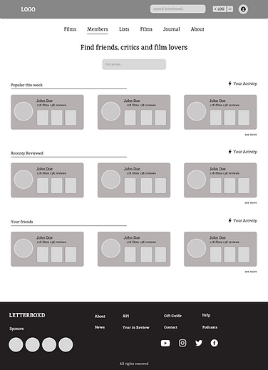
HOMEPAGE
Symmetrical Balance
The webpage has 4 cards under each category which are equally spaced on the screen. This shows a symmetry across the whole page and lays out an organized look of the page.
Symmetry
The add to watchlist icon fills with a yellow color when clicked. This provides instantaneous feedback to the user and lets them know that the specific movie has been added to their watchlist.


PROFILE
Navigation
The content on this page is placed keeping the principle of glanceability in mind. The stats, demographic information, external links and pinned(favorite) films are on the top of the page. The menu items allow easier navigation across the webpage when a user wishes to look for specific information.
Grids
This page composes two grid systems - column and hierarchical. This combination is easily scannable as the content is diverse.
JOURNAL
Metaphors
The speaker icon in the article description provides a visual cue to the users that the article has the feature of dictation.
Menus
The journal page has a lot of information contained in it. I have added menu items - Journal, Archives, Podcasts, and Newsletters to divide the content and make it more organized. With menus, it becomes easier to look up a particular article.

LetterBoxd

Have an idea?
Let's Talk.
New York, NY, 10005
Made with by Prachee