CONGRATULATIONS! YOU FOUND THE EASTER EGG


BlackBoard.com
In this Human-Computer Interaction project, I conducted a user study, performed competitive analysis, and created Usability Action Reports for Blackboard.com. I also conducted cognitive walkthroughs which informed the development of a redesigned page for the website, enhancing its usability and overall user experience.
Role
Project Lead
Timeline
Jan-May 2023
Skills
User Testing
Redesign
Competitive Analysis
User Research
Tools
Figma
PROJECT OVERVIEW
The project involves redesigning the Blackboard website, which is a web-based learning management system used by educators and administrators. Its purpose is to enhance user interaction and overall user experience. Blackboard enables the creation and delivery of course content, assessment of student learning, and management of communication and collaboration within courses. It is widely utilized by schools and universities for online courses and supplementary materials.
After extensively using the Blackboard website for five months, the team believes that the site deviates from users' mental models and requires improvements to enhance its effectiveness. We encountered difficulties related to viewing, navigation, and accessing content. We collectively evaluated the website and identified several common shortcomings after interviewing and evaluating the user’s pain points.
THE PROBLEM ?
During the evaluation of Nielsen's 10 Heuristics, we discovered several inconsistencies related to the system
ISSUES
-
System adaptability and efficiency
-
Conformity to established standards
-
Error messages
-
Correspondence with real-life situations
Initial identification of three problems was done through participant interviews, later uncovering more issues.
Despite frequent usage of the website, the evaluation team found it challenging to identify these issues; participants’ unique and intriguing shortcomings highlighted the problems.
Participants’ perspectives were crucial in identifying issues that contradicted Nielsen's heuristics.
Most issues were identified through
USER INTERVIEWS
USER PERSONAS
USABILITY ACTION REPORTS
Clear and Concise Language
-
Major usability problem causing confusion and frustration.
-
Significant impact, leading to wasted time and difficulty completing tasks.
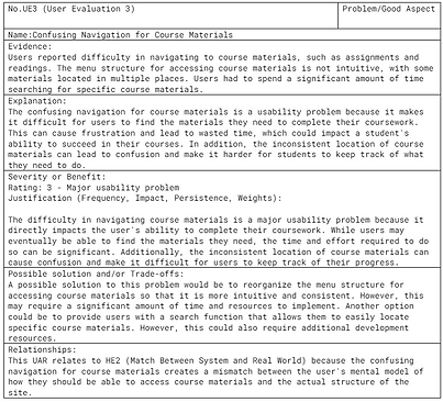
Confusing Navigation for Course Materials
-
Major usability problem impacting coursework completion.
-
Difficulty in navigation causes frustration and wasted time.
-
Potential negative impact on students' ability to succeed in courses
Course Organization and Layout
-
Positive aspect aiding easy navigation and quick location of information.
-
Reduces cognitive load and enhances learning efficiency.
INTERVIEWS
We recruited two participants to interview who are active users of the Blackboard website. We collaborated to create a list of questions, which we divided into three categories: structured, semi-structured, and open-ended. They provided us with substantial content which helped us get started on the project.


TASK SCENARIOS
The general tasks performed were:
Task 1: A professor creating and grading an online exam
PREPARATION & CONTEXT
fter a long day of back-to-back teaching, Prof. John Adams settles down with a cup of coffee to start grading papers but realizes he needs to create a new exam. Feeling frustrated by the familiarity and time-consuming nature of the task on Blackboard.
ACCSESSING THE PLATFORM
He begins by navigating to the Blackboard website and logging in to access his course page which lists the courses he is currently teaching.
INITIATING TEST CREATION
On the course page, Prof. Adams selects the “Tests, Surveys, and Pools” tab, where he chooses to create a new test to assess his students.
DESIGNING THE TEST
He proceeds to add various types of questions to the test, including multiple choice, short answer, and essay questions, ensuring a comprehensive evaluation of student understanding.
CONFIGURING THE SETTINGS
After designing the test, he adjusts crucial test settings such as setting a time limit, determining availability dates, and specifying grading options. He then previews the test to confirm that everything functions as intended and saves the test.
GRADING THE EXAM
Finally, Prof. Adams uses Blackboard’s grading tool to grade the exam. The tool automatically scores the multiple-choice questions, and he manually grades the open-ended questions, completing his task of both creating and grading the exam.
Task 2: A student participating in an online discussion forum
INITIAL ENGAGEMENT
Tyler, a sophomore at Drexel University, is checking Blackboard after class one morning to see if he has any pending assignments. While scrolling through, he notices a notification in the activity stream tab about an online discussion forum set up for conversation among peers on a specific topic.
ENCOUNTERING CHALLENGES
Upon deciding to participate, Tyler becomes nervous as he is unsure how to navigate to the discussion forum. His initial attempt to find help through Google proves unfruitful.
RECEIVING ASSISTANCE
Tyler receives guidance from a friend who provides a set of instructions on how to access and participate in the discussion forum.
NAVIGATING BLACKBOARD
Following the instructions, Tyler logs into Blackboard, navigates to his course page, and locates the “Discussion Board” tab. He selects it, finds the specific discussion forum, and reads the prompt.
PARTICIPATING IN THE DISCUSSION
After reviewing other students' posts to ensure he is contributing meaningfully, Tyler composes a thoughtful response to the discussion prompt and posts it to the forum.
ENGAGING WITH PEERS
Tyler completes the task by reading and responding to other students’ posts, providing critical feedback and engaging in a constructive and respectful manner, thus successfully participating in the online discussion.
USABILITY ACTION REPORTS
Performing a heuristic evaluation during website redesign allowed us to identify potential usability issues and improve the overall user experience. By using established usability heuristics, such as consistency, feedback, and error prevention, we systematically evaluated the website and made recommendations for improvements. The UARs will help us identify the challenges that our intended users encounter when navigating the website, and the recommended solutions will initiate our efforts to make necessary improvements to the current site.


LOW FIDELITY DESIGNS
Here are the steps I followed to create low-fidelity (low-fi) designs:
01. IDENTIFY ISSUES
I started by listing down the issues from the Usability Action Reports (UARs). This was essential to ensure all known design problems were considered right from the beginning.
02. SEPARATE IDEATION SESSIONS
I allocated two days to address these issues separately. This separation was crucial to ensure that the ideation process for solutions was unbiased and not influenced by other participants' ideas.
03. COLLABORATIVE VOTING
After the individual ideation sessions, we came together as a team to vote on the ideas that we wanted to include in our final low-fidelity prototype. This democratic approach helped ensure that the most agreed-upon and potentially effective ideas were selected.
04. ITERATIVE DESIGN
I created a few iterations of the low-fidelity prototype, adjusting and refining it based on our team discussions to make sure all identified issues were addressed before moving to user testing.
05. CONDUCT USER TESTING
I conducted the testing in a quiet room in the library using pen-and-paper prototypes. Despite the medium’s limitations—such as the lack of real interactive feedback, improper alignment of elements, and the absence of color - I focused on gathering qualitative feedback.
06. GATHER USER FEEDBACK
I collected and analyzed feedback from the participants, particularly noting any concerns about changes in the placement of elements that could affect users' muscle memory. This feedback was crucial as it informed the next phase of our design process, moving towards the High Fidelity Prototype.
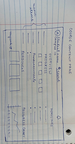
The image shows a sketch of the course content page. It features a navigation bar at the top, a section for announcements, and a main content area divided into an overview with sample data, progress indicators, and a progress chart. There's also a sidebar for course content, readings, and deadlines. This layout is designed to give students a comprehensive view of their coursework and progress in an educational platform.

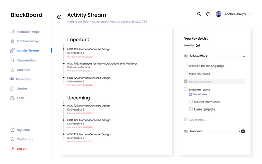
This is a sketch of the ACTIVITY STREAM PAGE for the LAD. The layout includes a header with a logo, user's name, and campus ID. The main content area is divided into two columns: one labeled "STREAM," which is further divided into "IMPORTANT" and "UPCOMING" sections presumably for notifications or events, and a "TO DO LIST" on the right with checkboxes and an option to "Add task." There's also a sidebar for navigation, with "Home" and "Streams" links, and the bottom left corner has a "myUMBC LOGOUT" option, indicating the specific portal for which this design is intended.

This sketch is of a review submission page within an educational platform. It includes a header "REVIEW SUBMISSION PAGE" with a search bar for student name or campus ID. There's a "Go Back" button for navigation. The main body is divided into two sections: one for submission history listing document names and another displaying a selected document with its grade (95/100), feedback, and a rubric. There's also pagination indicated at the bottom left corner, suggesting multiple pages of content.
HIGH FIDELITY MOCKUPS

After reviewing and conceptualizing the feedback from the user testing, we created a list of features and functionalities that we wished to accommodate in the final design for all the three pages.
We then ensured the new design concept followed the 10 Normans heuristics and that it addressed the known issues listed above.
We collaboratively decided on a color scheme and we decided to use a black and white theme with colors to differentiate selected items.
We also wanted to make sure the redesign addressed some accessibility issues. Using contrasting color schemes for people with color blindness or low vision would enhance their experience. We switched the position of announcements and progress charts. The tester’s feedback helped us to notice it.
The progress chart has intricate details such as value labels, markers, gridlines etc and fitting it in a small space did not suffice since the values were so tiny they were hardly visible.

There were no major changes to be made apart from the ones described above, thanks to re-iterations on the low fidelity prototypes. We chose a modular grid layout to ensure all the elements looked organized and were proportional to other elements on the page.
The margins, drop shadows on the card and gutters were thoughtfully put together so that it was pleasing to the eye. Cards had soft borders with a radius of 5 for each.
REFLECTIONS, REFLECTIONS...
After reviewing and conceptualizing the feedback from the user testing, we created a list of features and functionalities that we wished to accommodate in the final design for all the three pages. We then ensured the new design concept followed the 10 Normans heuristics and that it addressed the known issues listed above. We collaboratively decided on a color scheme and we decided to use a black and white theme with colors to differentiate selected items. We also wanted to make sure the redesign addressed some accessibility issues. Using contrasting color schemes for people with color blindness or low vision would enhance their experience.
We switched the position of announcements and progress charts. The tester’s feedback helped us to notice it. The progress chart has intricate details such as value labels, markers, gridlines etc and fitting it in a small space did not suffice since the values were so tiny they were hardly visible.
There were no major changes to be made apart from the ones described above, thanks to re-iterations on the low fidelity prototypes. We chose a modular grid layout to ensure all the elements looked organized and were proportional to other elements on the page. The margins, drop shadows on the card and gutters were thoughtfully put together so that it was pleasing to the eye. Cards had soft borders with a radius of 5 for each.
This part was the essence of all the research we had done in the previous 6 weeks and it was super exciting to work on it.
BlackBoard.com

Have an idea?
Let's Talk.
New York, NY, 10005
Made with by Prachee